Responsive web design

Just a few more days and the world will be greeting the New Year. In the tech industry, techno geeks and web design wizards are already contemplating on how the web design landscape will look like by the time the Year of 2016 is ushered in.

Our predictions for Web Design in 2016

The past couple of years have shown tremendous improvements in the way websites have been designed often with WordPress lauding over the content management platform arena. Competitors are actually not very far behind. And with the coming year, more innovations and a stiffer competition is believed to usher in a new era of web designs.

Animations that Come Alive

More and more websites will utilize the power of animations in their storytelling content. Although the technology itself is not entirely new, with newer and faster page loading times, websites of 2016 will be able to optimize on their user experiences creating more entertaining, visually attractive, truly engaging, and very interactive websites – perfect for scoring high on UX parameters.

Animations can be artfully integrated as page loaders, navigation, and non-scrolling menus, hover effects, slideshows and galleries, smooth scrolling, and motion animation as well as animated backgrounds. As visually powerful animations are, it is thus recommended to be very particular not to overdo it, lest you distract your audience and see them leaving your website faster than you can say ‘whatchamacallit’.

Domination of Material Design

Gone are the days (or years) when flat design ruled the web design market. With Google’s Material Design, presenting and developing really creative designs that offer depth and movement giving the illusion of realism among web users. While the technology itself is not new, there will be an increased usage of Material Design especially when the aim of web designers and developers is in the creation of cleaner and more modern websites that primarily focus on the need to improve user experiences.

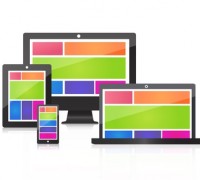
Emphasis on Responsive Design

With the fact that more and more people are using their smartphones and tablets and other mobile internet devices to browse the web, it is more than likely to see web designers and developers focus on the optimization of responsive web designs. However, one of the major issues that web developers have to contend with when designing responsive websites for mobile devices is performance. In order to achieve a truly functional and mobile-friendly website, web developers must be able to use conditional JavaScript loading, RESS, and responsive images that are defined by the use of percentage. The overall effects can also be enhanced further by subjecting the mobile site to performance testing for optimization purposes.

Bolder Typography and Colours

In 2016, it is expected that many websites will be sporting big, bold, and often brash-coloured typography. It is no secret that colour and typography are important tools in creating a brand image. Every web designer and developer knows that typography, when used properly, can reinforce the values being espoused by a particular company and convey important messages to their target market. With greater access to web fonts, it is expected that digital marketing specialists will be a lot bolder in their aims of creating unique branding strategies.

Apple Watch gadgets 2015

New and best-looking gadgets are always an attraction to all. Here you can see 10 gadgets 2015 which are smart, brilliant and also best looking besides being unique in features and uses.

1. Walk car of Cocoa Motors

This walk car is designed and developed by a twenty-six-year-old Japanese Kuniako Saito. It is the size of a laptop and looks like a skateboard, certainly one of the most defining gadgets 2015. This walk car is powered by a lithium battery, it is made of aluminium and weighs between two and three kilograms. According to Saito, this car is powerful enough to push wheelchairs. And can carry around 120 kg of weight. Its speed is 10 kilometres per hour and can travel up to 12 kilometers after a three-hour charging. For starting the car, one just needs to stand on it. Stepping out will stop the car. By simply changing the weight of the user the car can change directions also. After reaching your destination on the walk car, there is no worry of having to find a parking space. You can just pack it in your bag and carry it with you. We think the think the Walk Car is a hugely stylish and practical refinement on Segway technology and are keeping out eyes and ears peeled. On release it is estimated to cost $800 at the time of writing.

2. Acer Aspire Z5600

This is a wonderful desktop computer with touch screen features. It comes with a 2.33GHz processor, 8GB of RAM and 1TB of storage space, all packed in a sleek silver enclosure. The uniqueness of this model is that it can be operated by a mouse or a keyboard as well as with the fingers of the user. It is quite simple to use and very effective to add data entries or for doing online purchases.

3. Apple Watch

It is a smartwatch developed by Apple Inc. and is one of the defining gadgets 2015. It has the ability to track fitness and health oriented variations occur in the body of a person and also can integrate other Apple products and services. It is available in different models with various features.

4. Apple iPhone 6s

The iPhone is the fastest selling smartphone of the world at the moment breaking the previous sale records. It has 3D touch and Live Photos as unique features. It comes with an improved Apple A9 system chip to enable the optimal feature and more battery life. It outshines all the other smartphones in brilliance and performance.

5. Samsung Galaxy S6

A beauty in the mobile phone family comes with many good and advanced features like Exynos 7420 system chip, excellent camera with 16 MP capacity, best display screen and the fantastic wireless charging option.

6. Google’s Nexus 5X

This model is made by LG with Android 6.0 Marshmallow features. It has a good fingerprint scanner and supports USB type C connector for charging. It features a brilliant image sensor and good display and storage features. This smartphone is brilliant with numerous features and good for the pocket also.

7. Sony Xperia Z5

This smartphone comes with a powerful system chip and very many good and outstanding features including a camera sensor. It looks stylish and has a long battery life. it also comes with expandable storage features.

8. Sony Cyber-shot RX100 IV Pocket Camera

We think the Cyber-shot RX100 is the best pocket camera available at the moment as, among other things, it can capture images with the same capacity of a high-end-fixed-lens camera. It has a 1-inch image sensor, 4k video recording facility and a pop-up viewfinder. Its price is around $948.

9. Neato Botvac 80 Robot Vacuum

Robot vacuums are a brilliant choice to maintain your carpets and keep floors dust and dirt free. Normally they cannot climb stairs, and may get lost when the interface changes. But the latest Neato Botvac is exceeding all such limitations. We think it is a great investment, effortlessly keeping your house and office neat and clean.

10. DJI Phantom 3 Professional drones

Drones are the product of this era and now we are familiar to them buzzing overhead. they also probably take 1st place for most controversial gadget 2015. The Phantom 3 Professional drone of DJI has become extremely popular because of its remote controlled easy maneuvering features. It is quite simple to maneuver these drones once you master the necessary tricks and familiarize yourself with the necessary buttons. If you are a business owner who needs to shift plenty of lightweight products using a drone for doing the job and avoid the hassles of traffic blocks and carriers.

original iphone

The first iPhone

The iPhone is a smartphone designed and marketed by Apple Inc. The first generation was simply called iPhone, and following subsequent releases has become known as iPhone 1 or Original iPhone. It was announced on January 9 in the year 2007 and introduced in the US on June 29 of the same year. Quadband GSM cellular connectivity along with GPRS and EDGE support for the transferring of data were among its major features. The brain behind the idea of iPhone was former Apple CEO and company founder Steve Jobs, and the project started in the same year. Jobs conceived the idea of a multi-touch screen related to a computer on which one can type directly on the display without using a keyboard or mouse and later he visualized this feature in a mobile phone. With a selected group of Apple Engineers, the project progressed and they called it Project Purple 2.

After the January 9 announcement, the world waited six more months for the release of the first iPhone. It happened on June 29 and thousands of people waited outside the AT&T retail stores to buy them. Within hours, shops reported stock shortage and it also led to burglary and attacks. One million phones sold within 74 days after the release.

Read More →

Material design

What is Material Design

Material design can be considered as a richer alternative to the traditional flat design spearheaded by the Windows 8 metro tile system. With shadow effects and textures, this design gives a new dimension to the concepts of movements and depth in a web page, and for a user it appears more realistic and attractive.

The goal behind this creation is the generation of a more adaptable design to the modern digital trends compatible for mobile platforms also. This design, executed well, should fulfill the concept of a single website that offers a unified experience across different interfaces and device sizes. It should be suitable for the various input methods like touch, voice, keyboard, mouse etc.

Offers the best context

Material design, developed by Google offers a context in design and focuses on the effect of surfaces and edges as if it is a physical material to give visual clues to the ideas depicted in a web page. It is comparable to the visuals from real life and it helps the end user to understand dimensions and context. In material design a combination of style and content gives context to the user. It should give the user more cues to relate the digital space they are interacting with to a real, physical space. Because of this comparability the user automatically becomes more comfortable in the digital space.

Concept of Motion

The concept of motion is also used in material design to make a user more at ease in the digital space of a web page. Motion requires flow if it has a continuous nature. So if a user is viewing a moving entity with perfect flow then he or she will get a relatable feeling of it. Motion can integrate well with material design, and if done well and consistently it can provide a more intuitive user experience when it comes to navigating the site.

Combination of static designs and elements

Material design is the combination of static designs and elements. Shapes, colour, differences, typography etc. are part of it. The scope of colour in web designs is nearly limitless, and material design offers even more depth in terms of picking a certain colour palette to invoke a certain feeling with your end user. It uses the core principles of print design to make it more user-friendly and efficient. It gives a strong emphasis on the creation of user platforms that can work well in the different type of devices.

Responsive interaction

Responsive interaction is another user-friendly property of material web design. Normally, when a user interacts with an element of a design, it should provide the expected feedback. In material design, the user will receive a motion feedback along with the context for the material of which the user makes the interaction. In that way, the website provider can acknowledge the action of the customer effortlessly and thus improve the usability of the promoting product or brand also. Transitions between the interfaces are possible in material design. It offers design continuity to the user.

For a person with a creative mindset material design is a perfect choice to generate a website. This is because it opens up a world of possibilities and a large amount of scope for interpretation. As far as a client is concerned, they can be simply attractive and may invoke temptation to visit frequently. So, if you can create a website utilizing all the advanced possibilities of material design, it will be a great asset for the promotion of your business.

Many people like to accomplish everything they do online with their fingertips at any moment. They need to do their business on the move. They like to shop or reserve tickets or plan a trip while travelling or sitting in front of the television at home. They like to do all of these things with their trustworthy companion – their mobile phone or tablet. So even if you have a great business and a fantastic website to promote it, you will be in the backseat within no time unless you use responsive web design to make your website responsive to a potential customer while they are using their mobile device.

responsive web design

A mobile friendly website is one designed and optimized for a user using a mobile device to get the possibly perfect browsing experience. In a mobile friendly website, the navigation is simple and the selection of pages in them will be simple. The complicated design elements of the web page might be compressed or replaced to simplify the pages to make it loadable on a mobile device. The content must be laid out in a manner that can allow easy mobile consumption without the requirement of pinching and zooming, or too much scrolling. On a mobile friendly website, the phone numbers might be set up for enabling a click-to-call function. The addresses of the web page are set up to suit the device’s map function. The email options of the site also should be optimised to enable easy use on a mobile platform.

The general trend of today is to make more and more mobile-friendly updates in the websites. Mobile-friendly web pages are securing higher rankings in terms of search engine results.

For checking the mobile-friendliness and responsiveness of your website, you can examine the individual pages of your site using a Mobile-friendly testing website or can simply check the status of your entire website with the help of the mobile usability report in the webmaster tools. If the pages of your website do not employ responsive web design, you can expect a significant reduction in mobile traffic from Google search. But if you take care to improve your status as mobile friendly, then your status in Google search results may improve automatically. It is possible for you to accelerate the process by using the option provided by Google – ‘Fetch as Google’ with ‘Submit to Index’ so that your pages may be treated as mobile friendly when they are spidered and ranked in the future.

Sometimes you may fail to pass a mobile-friendly test even though your website uses responsive web design. In that case, you need to check the reasons behind it. Sometimes the Googlebot for smartphones may get blocked from resources like JavaScript or CSS, which can be essential in determining the legibility and mobile friendliness of a site. In that case, ensure that the mobile-friendly test is not showing blocked resources and prompt Googlebot to fetch the necessary files.

Online Banking

We all need a bank account in order to function and most of us use online banking as a matter of course. Most website you find tell you the best interest rates and the like which is OK. But what if you want to know how easy the online banking experience is.

1 NatWest

There online banking system is very easy to use and covers all the normal function you would expect. If you search online will find allot of negative reviews of their online banking, but from our personal use and experience we find the system very easy to use. One great feature is the ability to get cash out of an ATM even if you do not have your card. This can also be used to send money to someone. You simply text them a code and the amount you want them to have access to. They just then go to any NatWest or Tesco ATM enters the code and the amount and they get the cash. Very useful for sending siblings emergency cash. They have a great app for iPhone which uses your fingerprint to gain access to your online account and send money as described above via text message.

Our Rating: 4.5/5

Natwest Login Information

Natwest Login

2. Halifax

The Halifax banking system does most of what you would expect from an online account, but many users have had had problems with setting it up. The customer service is also not the best we have found. Their high street staff are good but online help and phone support leave allot to be desired.

They have an online app which is much better than their online offering and is a big improvement.

Our Rating 3/5

Halifax Login

3. Lloyds Bank

If any bank has gone backwards in the online world it is Lloyds bank. They used to have a great online banking experience. We have had many users getting in OK only to them be asked again for their password and then locked out of online banking. Telephone support is also at the lower end of what you would expect from a major high street bank.

Our rating 2/5

Lloyds bank login

4. Barclays Bank

Barclays is another bank that started off well but seems to have gone backwards in their online offering. If you have multiple Barclaycards you will often find they have their own separate login.

It is possible to have them grouped together but we had three and could only get 2 combined. This was in part because Barclays acquired egg and converted their cards to Barclaycard but could not get this added to main account even after contenting them on multiple occasions.

We have also had multiple reports of unreliable internet service, however we did get one person saying they were happy, so added 0.5 to our rating.

Our Rating 1.5/5

Barclays bank Login